
Every Single Photo Is Polished, So Why Does Your Instagram Grid Still Look Like a Mess?
By Huang Wen — covering Instagram visual branding
A-He posted her new product shot at 11:20 p.m. The silver jewelry sat on gray linen, lit in a cool Morandi tone she'd spent half an hour dialing in. She rewrote the caption three times and even checked the hashtag order against competitor accounts. After posting, she stared at her phone for almost ten minutes — likes were climbing faster than usual. She locked her screen, satisfied this one had landed.
The next afternoon at three, she casually opened Instagram Insights to check the numbers. Her profile had gotten thirty-seven visits that day, but only two new followers. Puzzled, she clicked into her own profile — not to look at the new product photo, but to scroll through the whole grid the way a stranger would on a first visit. What she saw made her frown: that cool gray photo sat right next to a warm-yellow unboxing video cover from the previous week, and just below it was a cluttered livestream screenshot from two weeks earlier. Each photo held up fine on its own, but together they looked like three different accounts fighting for attention.
A-He isn't alone in this. People running multi-account setups or visual brands spend most of their time obsessing over individual photos — color grading, composition, captions, tags. A single photo can take a whole evening to get right. But what actually decides whether a new visitor hits follow usually isn't that one photo — it's the entire "wall" they see the moment they scroll through the profile.
No matter how polished a single photo is, if the grid isn't planned as a whole, new visitors may see clashing tones instead of a coherent brand identity when they scroll through your profile. Previewing candidate photos together before you post is a low-cost step — and one that's easy to skip.
- What usually decides whether a new visitor follows is the overall impression of the grid, not how polished any single post is
- Common grid layouts include checkerboard, row-based, column-based, and single-color-family approaches — none works for every account; it depends on content type and posting frequency
- Dragging candidate photos into a feed planner before posting surfaces tone clashes early, which costs less than fixing them after the fact
- Layout determines whether people stay after they land on your profile; posting time determines whether people see it in the first place — one doesn't substitute for the other
- The same approach applies to Pinterest, TikTok, Facebook, and other platforms where the profile page has its own visual presentation logic
The feed planner and image-checking tools mentioned in this article are part of SocialEcho. Built for brands going global and multi-account creators, SocialEcho is an all-in-one social media AI workspace that connects directly to 11 platforms, including Instagram, TikTok, and Pinterest. It brings grid preview, bulk scheduling, and analytics review together in a single dashboard — well suited to accounts where visual consistency is part of the competitive edge.
Why Does the Grid Look Messy Even When Every Photo Looks Good on Its Own?
Because most people judge "good-looking" at the smallest possible unit — a single photo — while Instagram's profile display logic forces nine photos into one larger visual block. Single-photo thinking governs the quality of the content itself; whole-grid thinking governs the first impression an account makes. These are two different jobs, but they're often treated as one.
The daily workflow for visual brand owners and multi-account creators tends to revolve around individual posts: what caption goes with today's photo, whether this post needs an engagement prompt, whether this filter fits the brand better than the last one. Every photo gets scrutinized, and some teams even have someone dedicated to retouching and photo selection.
The problem is that a new visitor landing on an unfamiliar profile doesn't scroll through post by post the way a loyal follower does. They glance at the grid thumbnails at the top and, within a few seconds, decide whether this is the kind of account they want to follow. In those few seconds, what they see isn't the detail of any one polished photo — it's the combined tone, composition rhythm, and visual density of nine photos together. If every photo follows its own logic, the result is exactly what A-He ran into: each one fine on its own, but scattered together.
This is also why teams that specialize in multi-account management usually have someone whose job is to look at the whole picture — not to check whether each photo is polished enough, but to check whether the batch holds together as one tone. That role is often missing on smaller teams, where the default assumption is "if every photo looks good, the whole thing will too" — until the numbers prove otherwise, the way they did for A-He.
What Actually Shapes the First Impression of an Instagram Profile?
It comes down to the overall tone, composition rhythm, and visual density of the grid as seen all at once in a few seconds — not how finished any single photo is on its own.
A-He later mentioned this to a friend who works in private-domain marketing, and one line stuck with her: "You're polishing the details that your loyal followers notice. New visitors never even get to the detail stage — they have to get past the profile page first."
When a stranger clicks into a profile from the Explore page, a hashtag, or someone else's share, they typically don't stay long, and their attention doesn't land on any single post. Instead, they scan the whole grid and form a quick, rough judgment: is this account's tone consistent, professional, and in line with what they expected? If that judgment doesn't hold up, they usually swipe away — without ever giving any single post a closer look.
The first impression a profile leaves on a new visitor is measured by the overall visual consistency of three, six, or all nine posts together — not by any single photo pulled out on its own.
This gap shows up especially clearly for multi-account creators, since these accounts often span several series and content formats — unboxings, tutorials, product shots, lifestyle scenes. Each series may be polished on its own, but without a shared color anchor or layout rhythm across series, the combined result can easily end up looking like the "three accounts fighting" effect A-He experienced.
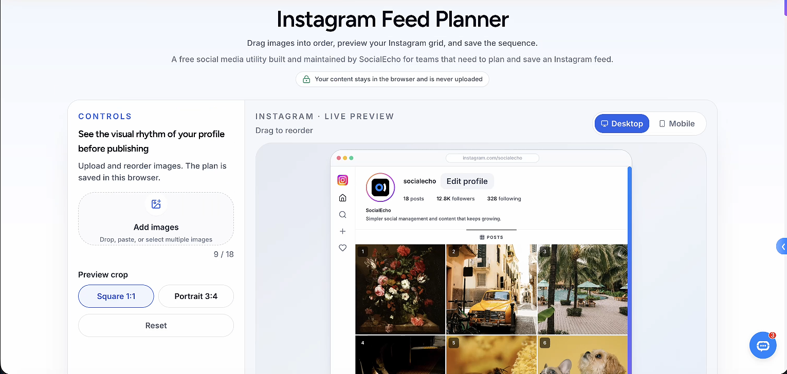
A-He started doing something different: before posting, she'd lay out the next few photos she planned to publish and look at the overall effect first, instead of waiting until after posting to see what the profile looked like. She uses the feed grid planner, where she can upload upcoming photos, drag them to reorder, and preview how they'll look together as a grid — something she'd never done before, because she'd always assumed "posting order" and "layout appearance" were separate things. She hadn't realized Instagram's profile display ties the two together directly.
What Are the Common Ways to Lay Out an Instagram Grid?
The common approaches are checkerboard, horizontal rows, vertical columns, and single-color-family — none is inherently better; it depends on your account's content structure and posting frequency.
Once you preview the grid ahead of time, the layout usually settles into one of these approaches:
| Layout | Visual Effect | Best Suited For | Maintenance Effort |
|---|---|---|---|
| Checkerboard alternating | Two tones or content types alternate, creating a strong rhythm | Multi-account setups with varied content (e.g., product shots alternating with lifestyle scenes) | Medium — requires ongoing attention to keep the alternating pattern consistent |
| Horizontal rows | Each row of three photos shares a color family or composition, with variation from row to row | Brand accounts with cyclical updates and a strong sense of series | Medium-high — posting order needs to be planned in advance |
| Vertical columns | One vertical column of three photos forms a visual throughline | Accounts focused on a single product line or a long-running series | Higher — inserting other content easily breaks the throughline |
| Single color family | All nine photos lock into one or two dominant tones, staying cohesive with less variation | Visual brand accounts that prioritize tone consistency and post less frequently | Lower — you mainly just need to stick to the color palette when selecting photos |
No single layout is inherently better — each one serves a combination of account type and posting rhythm. It's usually worth understanding your own content structure first, then choosing a layout to match, rather than the other way around.
For accounts that are just starting out and don't have much content yet, a single color family usually makes it easier to establish a tone early on, with relatively low maintenance. Once content types diversify, checkerboard or row/column layouts tend to accommodate more layers of content, though they also require more consistent planning.
How Do You Preview Your Grid Before You Post?
Dropping candidate photos into a feed planner and checking the overall effect before deciding on posting order costs a lot less than discovering a tone clash after you've already posted. Here's a step-by-step approach:
- Collect three to four candidate photos before locking in a posting order
- Upload the candidates to the feed grid planner, drag them into position, and check whether the overall tone and rhythm hold together
- Use the crop and composition checker to verify the framing, so the main subject isn't cropped out or blurred at thumbnail size
- Use the image size guide checker to check different asset dimensions, so key parts of the image aren't cropped off after upload
- Once you're happy with the overall effect, use bulk content scheduling to line up the photos you've already confirmed in the planner, reducing the chance of a last-minute insert disrupting the rhythm
- After posting, use analytics to check the relationship between profile visits and new followers, to see whether the grid adjustment actually moved the needle on new-visitor conversion
For series content that needs bulk photo production and captions, you can also use AI content creation to generate a first draft and then fine-tune the style consistently, cutting down on the tone fragmentation that happens when content comes from different moods or styles. As for timing, the best posting time finder can help with scheduling, but timing solves "will anyone see it" while layout solves "will they stay after they see it" — these are two different problems, and picking the right posting time won't make up for a visually scattered profile.
For teams already running accounts across multiple platforms, this approach isn't limited to Instagram. Pinterest's pin board, TikTok's profile video covers, and even Facebook's profile album display all follow a similar logic where the whole takes priority over any single piece. If a team runs accounts on several platforms at once, the habit of planning visual consistency ahead of time is worth carrying across all of them. For a closer look at Instagram posting rhythm and performance, you can check the Instagram scheduling and Instagram analytics resources — layout, scheduling, and analytics work better viewed together rather than handled separately.
A-He's habit now: every time she has three or four candidate photos ready, she drags them into the planner and looks at the overall effect before deciding on posting order. She says the step itself takes only a few minutes, but what it changed was how she looks at content — from "is this photo good enough" to "does this photo fit with what's around it." That shift in perspective may be the real starting point for turning a scattered profile into a coherent one.
FAQ
Does grid layout really affect follower growth?
It affects a new visitor's first impression and how likely they are to stick around on the profile — it's not the only variable in follower growth. What grid layout can improve is whether someone swipes away in those first few seconds. Whether an account keeps growing still depends on content quality, positioning, and engagement, which all need to work together — layout alone isn't enough.
Do I need a dedicated tool to preview the grid before posting?
Not necessarily — you can place candidate photos side by side and compare them visually. But when you're managing multiple accounts with a high volume of candidate photos and frequent posting, dragging photos around in a feed grid planner tends to be more intuitive. It simulates the actual profile layout after posting more quickly, saving the time spent taking and comparing screenshots repeatedly.
If I pick the wrong grid layout, is it hard to fix?
Usually not. Layout mostly comes down to adjusting your posting rhythm and photo-selection habits. Older content doesn't need to be redone — as long as new content follows an overall plan going forward, the profile's visual consistency will gradually improve without needing a complete overhaul.
For a new account, is a single color family or checkerboard layout a better fit?
For accounts still building up content, a single color family usually has lower maintenance cost and makes it easier to establish a tone early. Once content types diversify, moving to a checkerboard or row/column layout tends to work more comfortably and can carry more layers of content.
Should I prioritize posting time or grid layout first?
They solve different problems — posting time determines whether people see your content, and layout determines whether they stay after they see it. It's generally worth managing both at once rather than finishing one before starting on the other; otherwise you can end up posting at the right time and still losing visitors at the profile stage.
Key Takeaways
- What usually decides whether a new visitor follows is the overall impression of the grid, not how polished any single post is
- Common layouts include checkerboard, row-based, column-based, and single-color-family — the right choice depends on account type and posting frequency, and none works for every account
- Dragging photos into a feed planner before posting surfaces tone clashes early, which costs less than fixing them after the fact
- Layout determines whether visitors stay; posting time determines whether they see the content at all — both need to be managed together
- The same approach applies to Pinterest, TikTok, Facebook, and other platforms where the profile page has its own visual presentation logic
Worth noting: profile visual consistency can improve a new visitor's first impression and willingness to stay, but it doesn't replace content quality, account positioning, or engagement. Grid layout is also not the only variable in account growth — actual results will vary depending on account size, content type, and niche, and any adjustments are worth validating against your own data over time.
;}.cls-2{fill:%230868f7;}.cls-3{fill:url(%23未命名的渐变_44);}.cls-4{fill:%23333;}%3c/style%3e%3clinearGradient%20id='未命名的渐变_8'%20x1='33.73'%20y1='100.61'%20x2='-0.03'%20y2='-1.06'%20gradientUnits='userSpaceOnUse'%3e%3cstop%20offset='0'%20stop-color='%237ae9fb'/%3e%3cstop%20offset='0.67'%20stop-color='%232b90f8'/%3e%3cstop%20offset='1'%20stop-color='%230868f7'/%3e%3c/linearGradient%3e%3clinearGradient%20id='未命名的渐变_44'%20x1='27.86'%20y1='18.67'%20x2='68.36'%20y2='22.22'%20gradientUnits='userSpaceOnUse'%3e%3cstop%20offset='0'%20stop-color='%235ac7f2'/%3e%3cstop%20offset='1'%20stop-color='%230868f7'/%3e%3c/linearGradient%3e%3c/defs%3e%3cpath%20class='cls-1'%20d='M29,28.74V81.91l-9.51-3.68v0L8.52,74A7.17,7.17,0,0,1,4,67.32V24.54A3.76,3.76,0,0,1,9.08,21Z'/%3e%3cpath%20class='cls-2'%20d='M68.09,78.07a13.15,13.15,0,0,1-17.9,12.06L29,81.91h0V28.74L50.19,37A13.17,13.17,0,0,0,68.08,25.3h0Z'/%3e%3cpath%20class='cls-3'%20d='M68.08,25.3a13.19,13.19,0,0,1-6.73,10.87A13.09,13.09,0,0,1,50.19,37L29,28.74V6A3.76,3.76,0,0,1,34.1,2.52l25.59,9.91A13.22,13.22,0,0,1,68.08,25.3Z'/%3e%3cpath%20class='cls-4'%20d='M129.06,81.76a4.33,4.33,0,0,1-3.19-1.31,4.4,4.4,0,0,1-1.31-3.24V56.86H97.65V77.21a4.36,4.36,0,0,1-1.35,3.2A4.68,4.68,0,0,1,93,81.76a4.32,4.32,0,0,1-3.19-1.31,4.37,4.37,0,0,1-1.32-3.24V27.27A4.58,4.58,0,0,1,89.83,24a4.59,4.59,0,0,1,7.82,3.27V48.15h26.91V27.27A4.58,4.58,0,0,1,125.91,24a4.59,4.59,0,0,1,7.82,3.27V77.21a4.37,4.37,0,0,1-1.36,3.2A4.65,4.65,0,0,1,129.06,81.76Z'/%3e%3cpath%20class='cls-4'%20d='M163.77,81.66c-6.57,0-11.76-1.92-15.44-5.7s-5.54-9.07-5.54-15.74a26.76,26.76,0,0,1,2.09-10.43,17.72,17.72,0,0,1,6.67-8.06,19.15,19.15,0,0,1,10.68-2.95,19,19,0,0,1,10.46,2.8,18.7,18.7,0,0,1,6.55,7.36,22.53,22.53,0,0,1,2.36,10.28A4.51,4.51,0,0,1,177,63.77H152.23a10.8,10.8,0,0,0,3.49,6.65c2,1.68,4.88,2.52,8.66,2.52a22.25,22.25,0,0,0,7.54-1.21c.74-.3,1.55-.67,2.37-1.07a3.75,3.75,0,0,1,1.84-.4,4.09,4.09,0,0,1,3,1.15,4,4,0,0,1,1.12,3,4.38,4.38,0,0,1-2.58,3.82,32.34,32.34,0,0,1-6.36,2.61A28.67,28.67,0,0,1,163.77,81.66ZM172.4,55.9a9.72,9.72,0,0,0-1.63-4.56A9.9,9.9,0,0,0,167,48a10.38,10.38,0,0,0-4.64-1.14,12,12,0,0,0-4.77,1.06,9.54,9.54,0,0,0-4.89,5.66,11.78,11.78,0,0,0-.51,2.3Z'/%3e%3cpath%20class='cls-4'%20d='M193,81.64a4.49,4.49,0,0,1-4.51-4.55V27.28A4.58,4.58,0,0,1,189.84,24a4.48,4.48,0,0,1,3.28-1.36A4.36,4.36,0,0,1,196.35,24a4.46,4.46,0,0,1,1.31,3.31V77.09a4.34,4.34,0,0,1-1.35,3.2A4.67,4.67,0,0,1,193,81.64Z'/%3e%3cpath%20class='cls-4'%20d='M263.79,81.71a5.7,5.7,0,0,1-4.2-1.74,5.76,5.76,0,0,1-1.73-4.19V27.37a4.58,4.58,0,0,1,1.35-3.27A4.59,4.59,0,0,1,267,27.37V72.53h24a4.58,4.58,0,0,1,3.27,7.82A4.66,4.66,0,0,1,291,81.71Z'/%3e%3cpath%20class='cls-4'%20d='M424.48,81.74a4.71,4.71,0,0,1-2.71-.88,5.43,5.43,0,0,1-1-1l-.07-.09-12.41-17-5.41,5v9.44a4.31,4.31,0,0,1-1.36,3.19,4.66,4.66,0,0,1-3.3,1.36A4.29,4.29,0,0,1,395,80.42a4.36,4.36,0,0,1-1.32-3.23V27.37A4.58,4.58,0,0,1,395,24.1a4.52,4.52,0,0,1,6.58.12,4.54,4.54,0,0,1,1.24,3.15V56.31l17.72-16.38.05,0a4.8,4.8,0,0,1,2.94-1.11,4.4,4.4,0,0,1,3.27,1.2,4.57,4.57,0,0,1,1.2,3.27,4.44,4.44,0,0,1-.77,2.33,7.45,7.45,0,0,1-1.43,1.65l-11,9.64,13.34,17.68a5,5,0,0,1,1,2.71,4.12,4.12,0,0,1-1.36,3.24A4.64,4.64,0,0,1,424.48,81.74Z'/%3e%3cpath%20class='cls-4'%20d='M317.93,81.76a21.5,21.5,0,1,1,21.17-21.5A21.37,21.37,0,0,1,317.93,81.76Zm0-34.1a12.61,12.61,0,1,0,12.42,12.6A12.52,12.52,0,0,0,317.93,47.66Z'/%3e%3cpath%20class='cls-4'%20d='M212.18,101.22a4.12,4.12,0,0,1-3.05-1.26,4.17,4.17,0,0,1-1.26-3.1V43.34a4.37,4.37,0,0,1,1.3-3.14,4.26,4.26,0,0,1,3.13-1.3,4.19,4.19,0,0,1,3.1,1.26,4.32,4.32,0,0,1,1.26,3.16,20.77,20.77,0,0,1,13-4.54,21.51,21.51,0,0,1,0,43,20.51,20.51,0,0,1-13-4.57V96.86a4.15,4.15,0,0,1-1.3,3.06A4.5,4.5,0,0,1,212.18,101.22Zm17.43-53.63c-6.23,0-12.93,4.11-12.93,12.72a12.73,12.73,0,0,0,25.46,0A12.71,12.71,0,0,0,229.61,47.59Z'/%3e%3cpath%20class='cls-4'%20d='M365.76,81.76a21.5,21.5,0,1,1,21.18-21.5A21.37,21.37,0,0,1,365.76,81.76Zm0-34.1a12.61,12.61,0,1,0,12.42,12.6A12.52,12.52,0,0,0,365.76,47.66Z'/%3e%3c/svg%3e)