
Special Symbols and Kaomoji for Instagram: How to Copy-Paste Them Into Your Bio Without Looking Cheap
By Zhao Lei — covering Instagram and Xiaohongshu content design
Aya is a freelance creator who covers fashion and lifestyle content, running accounts on three platforms at once — the classic multi-platform creator grind. She shoots content during the day, edits at night, and spends most of what's left trying to figure out why everyone else's follower count grows faster than hers. Last week she came across a bio in her niche that read "⋆。°✩ collab welcome ✩°。⋆" — light, breezy, obviously designed with care. She zoomed into the screenshot until she could make out every character, then tried to recreate it symbol by symbol, digging through her keyboard's special character panel and scrolling endlessly through emoji pickers. Almost forty minutes later, what she'd pieced together still wasn't quite right — some symbols didn't match, the spacing looked cramped, and when she pasted it into her own bio, it looked fine on her phone but a few characters turned into boxes on her tablet. She vented about it in a creator support group chat, and that's when she learned she wasn't just clumsy — there's an actual method to this.
Special symbols and kaomoji generally fall into five categories — decorative, dividers, brackets/quotes, arrows, and kaomoji. Use a curated copy-paste tool instead of squinting at someone else's screenshot. Piling on more symbols in your bio doesn't make it look better — that pile-up is what actually reads as cheap. Decorative symbols come from obscure Unicode blocks, and some older devices or custom OS builds render them as boxes, so contact info and collab emails shouldn't rely on symbols alone. Before you publish, preview on a different device and run a length checker to make sure nothing gets cut off.
The symbol copy-paste, fancy font, and bio tools mentioned in this article are all provided by SocialEcho, an all-in-one social media AI workspace built for businesses expanding overseas. It connects officially and compliantly to 11 platforms including Instagram, TikTok, and X, bringing content creation, publishing, engagement, and analytics into one place — a good fit for creators managing accounts across multiple platforms at once.
What Types of Special Symbols Are Commonly Used on Social Media?
Sorting symbols into five categories by purpose makes them far easier to find than eyeballing someone else's profile. When people first try to decorate their profile with symbols, the real struggle usually isn't "where do I copy this from" — it's "I don't even know what I'm looking for." These five categories cover most of what shows up in bios and captions:
- Decorative symbols: stars, flowers, hearts — think ★ ☆ ✦ ✧ ❀ ♡. These are typically used as accents or to emphasize a word, without carrying specific information on their own.
- Divider symbols: used to visually break up text, like wavy lines, dotted lines, or combinations of asterisks and dashes. Common in bios for separating "who you are" from "how to reach you."
- Brackets and quotes: Japanese-style full-width brackets such as「」【】〈〉 read as more understated than English quotation marks and are often used to wrap a short label, like 「collab inquiries」.
- Arrows and directional marks: symbols like → ➤ ➹ that guide the eye, often pointing toward a link somewhere in the bio.
- Kaomoji: originating from Japanese internet culture, kaomoji use punctuation and symbols to express emotion. Unlike the sideways, rotated emoji common in the West, kaomoji are read right-side up — like the happy (。♥‿♥。), the resigned shrug ¯_(ツ)_/¯, the cutesy (^▽^), or the shy (〃ω〃). They convey more emotional nuance than a standard emoji and work well at the end of a caption in place of a spoken tone of voice.
All five categories work in an Instagram bio, a Threads profile, an X header description, or a TikTok signature line — but different platforms and devices don't render these characters with the same level of tolerance. The table below gives a rough sense of what to expect; the section on "Why do symbols turn into boxes on some devices?" below covers the actual cause:
| Symbol Type | Common Use | Examples | Cross-Device Compatibility |
|---|---|---|---|
| Decorative symbols | Accents, emphasizing a word | ★ ☆ ✦ ✧ ❀ ♡ | Lower — many obscure characters, prone to turning into boxes on older devices |
| Divider symbols | Visual line breaks, separating info blocks | ┈┈┈┈┈┈ | ⋆。°✩ | Moderate — simple symbol combos are usually fine |
| Brackets and quotes | Wrapping short labels, highlighting keywords | 「collab inquiries」【new arrivals】 | Higher — covered by most system font libraries |
| Arrows and directional marks | Guiding the eye to a link or button | → ➤ ➹ | Higher — part of common symbol blocks |
| Kaomoji | Closing tone, replacing a spoken phrase | (。♥‿♥。) (^▽^) | Moderate — mostly punctuation combos, generally more compatible than obscure decorative symbols |
The practical takeaway: use decorative symbols sparingly as accents, and feel free to lean on basics like arrows and brackets — the symbols most likely to break on older devices are usually the fanciest-looking decorative ones.
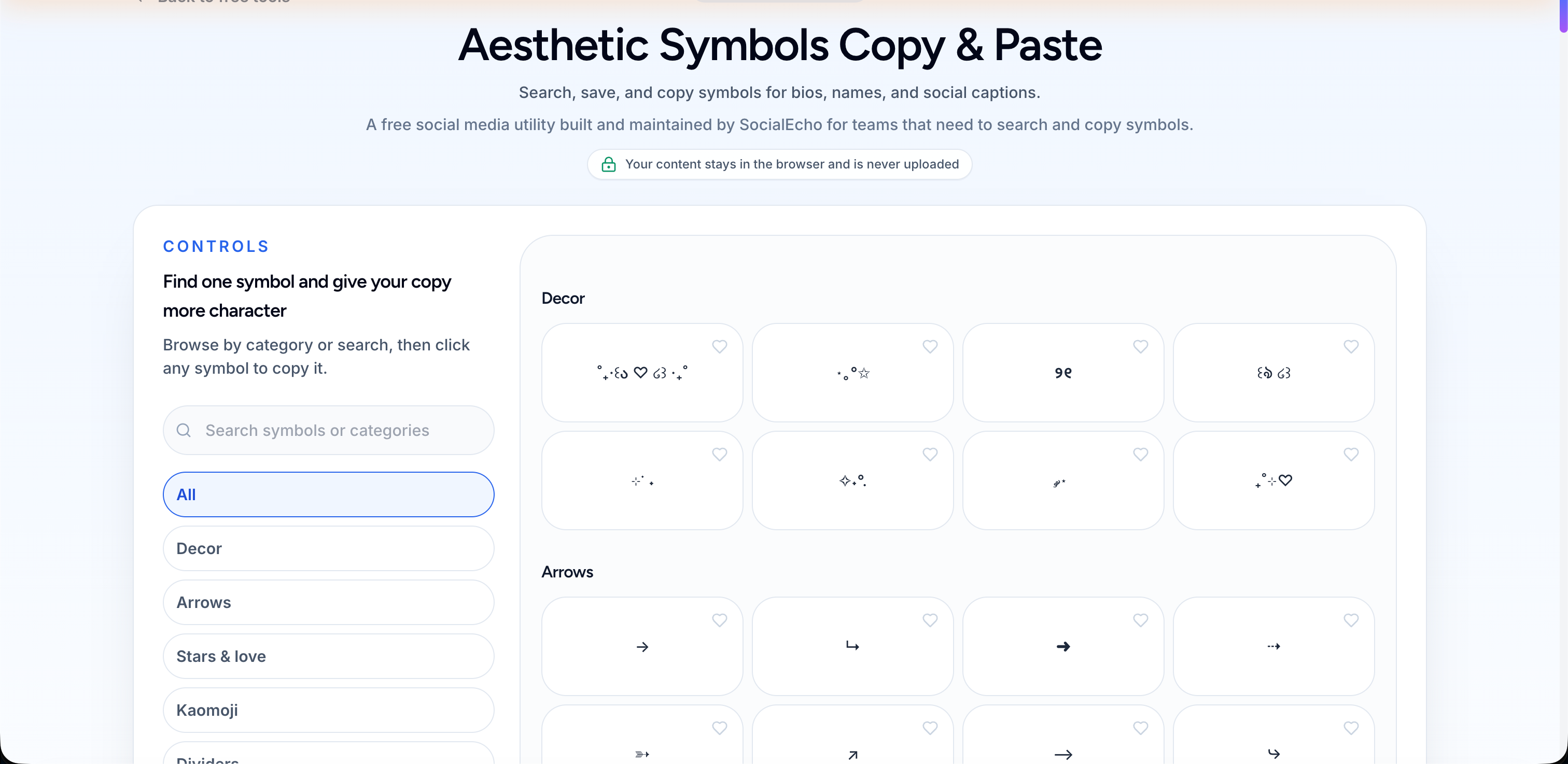
If you'd rather not type each one out manually, you can use a ready-made symbol and kaomoji copy-paste tool — just click through the categories and copy with one tap, skipping the screenshot-counting process Aya went through.
How Do You Use Symbols in Your Bio Without Looking Cheap?
Symbols themselves aren't inherently cheap or elevated — what reads as cheap is usually the clutter: five or six different symbol styles crammed into one line, with no visual focus and a lot of noise. Bios that actually look good tend to follow one simple rule: each line serves one purpose, and symbols act as punctuation, not the main event.
Here's a sequence you can walk through when laying it out:
- Pin down the single purpose of each line — whether it's stating who you are, adding a visual break, pointing to a link, or closing with a tone. One line, one purpose; don't cram several goals into the same line.
- Open your identity line with one decorative symbol: something like
✧ Fashion creator · Shanghai, using「·」to separate identity from location — no need to add anything else. - Give the divider its own line: something like
┈┈┈┈┈┈┈┈┈┈, used to separate your "who I am" section from your "how to work with me" section. This reads cleaner than sprinkling symbols across every line. - Use exactly one symbol to guide the call-to-action line: something like
Link in bio for collabs →, with the arrow at the end pointing toward the link — no extra decoration needed. - Close with a kaomoji instead of an exclamation point: something like
Grinding away today (๑•̀ㅂ•́)ﻭ, placed at the very end of the caption. It's more distinctive than stacking exclamation points. - Double-check your symbol variety: aim to keep the number of symbol types in a single bio to two or three, and don't repeat decorative and divider symbols on the same line.
At the end of the day, white space does more for that "polished" feeling than clutter ever will — symbols are there to punctuate and guide, not to fill every gap.
If you want your symbols and fonts to feel more cohesive, pair them with a fancy font generator — use a stylized font for your identity label and plain symbols for dividers, so the visual hierarchy stays clear instead of competing with itself. If you're stuck on how to structure the whole bio, an Instagram bio generator can give you a framework first, which you then decorate with symbols — that's an easier rhythm to work with than piecing it together from a blank line.
For multi-platform creators running several accounts at once, there's a consistency issue that's easy to overlook: if the symbol style varies too much between accounts, followers who discover you on a second platform may feel like the persona doesn't quite match up. A safer approach is to settle on a "signature symbol combo" — say, a specific divider paired with a specific kaomoji sign-off — and apply it across every account's bio and signature line. That builds a recognizable visual signature instead of switching styles on a whim. If you need help polishing the tone and structure of the copy itself, an AI writing tool can generate a first draft while leaving symbol placeholders in place, which is easier to fine-tune by hand than rewriting the whole thing from scratch.
Why Do Symbols Turn Into Boxes on Some Devices?
Because most decorative symbols come from fairly obscure blocks of the Unicode character set, and different operating systems, browser versions, and app font libraries don't support these obscure characters at the same level. What Aya ran into — symbols displaying fine on her phone but showing up as boxes on her tablet — wasn't a fluke. It's a fairly common compatibility issue. Older Android builds, certain manufacturer-customized OS versions, and some platforms' web dashboards or ad management interfaces render unsupported characters as a hollow box (often called "tofu" in the industry) instead of throwing an error or skipping the character — leaving no clue as to what was supposed to be there.
The frustrating part is that when creators preview on their own newest phone, everything looks fine, so the problem stays invisible until a follower opens it on an older device or a different platform. And that kind of feedback rarely makes its way back to you — most people who see a box of boxes just assume "this person's bio is broken" and scroll on, without bothering to leave a comment about it.
The key point: whether your symbols render correctly isn't something you can usually verify on your own end — the problem tends to show up somewhere you can't see.
What Kind of Information Shouldn't Rely on Symbols Alone?
Key information like contact details, collab emails, promo codes, and event dates shouldn't rely on symbols or fancy fonts alone. Feel free to use decorative symbols generously, but anything that carries essential information should also be spelled out in plain, clear text. Symbols handle the aesthetics; text handles clarity — the two should work together, not stand in for each other.
There's also an accessibility angle here: screen readers often read decorative symbols or stylized fonts aloud by their Unicode character names, or simply skip characters they can't parse. For visually impaired users who rely on a screen reader to browse social media, a line of text chopped up with symbols becomes a poor experience, and key information can end up lost entirely.
Decoration is decoration, information is information — keep the two on separate tracks. Looking good and being understandable aren't mutually exclusive.
In practice, spending an extra minute on a few small checks before you publish saves a lot of headaches later:
- Preview your bio and captions on an older device or a different browser to check for boxes.
- If symbols are eating up a good chunk of your character count, use the bio length checker to confirm nothing's getting cut off by the platform.
- If your caption uses a lot of symbols, run it through the caption length checker too, so key information doesn't get pushed into the hidden portion.
- If you've adjusted where a link sits in your bio, the link placement checker can confirm the link hasn't been crowded out of sight by symbols.
If you're managing multiple accounts, using a publishing tool to preview how everything actually renders across platforms before you post saves a lot of time compared to opening each app manually. And if you want to know whether a decorated bio actually moves the needle on engagement, analytics or Instagram-specific analytics can show you changes in profile visits and follow conversion — letting data, not a gut feeling, decide whether a symbol combo is worth keeping.
Symbols and kaomoji are ultimately seasoning, not the main course — they can give an ordinary bio a bit of breathing room and personality, but they can't carry the weight of weak content, and they won't paper over gaps in your persona or engagement. Aya eventually settled on one fixed divider-and-kaomoji combo for the bios across all three of her accounts. Not because the combo itself was especially special, but because once it was consistent, followers could tell at a glance that it was the same person across different platforms — and that recognizability mattered more than how flashy the symbols looked.
Frequently Asked Questions
Where can I copy special symbols and kaomoji for free?
You can use the symbol and kaomoji copy-paste tool directly — browse by category (decorative, dividers, brackets, arrows, kaomoji) and copy with a click, no need to trace them off someone else's profile screenshot.
Why do my bio symbols look fine on my own phone but turn into boxes when other people open it?
Because most decorative symbols come from obscure Unicode blocks, and creators typically preview on newer devices, which makes compatibility issues easy to miss. Boxes tend to show up only when followers open your bio on an older system or a different platform, and that kind of feedback rarely gets reported back to you — so it's worth previewing on a different device or browser before you publish.
What's the difference between kaomoji and regular sideways emoji?
Kaomoji originate from Japanese internet culture and express emotion through combinations of punctuation and symbols, read right-side up — like (。♥‿♥。). The emoji icons common in the West are typically small rotated graphics. Kaomoji convey more emotional nuance and work well at the end of a caption or bio as a stand-in for a spoken tone of voice.
How many types of symbols should I use in one bio?
There's no fixed rule, but from a readability standpoint, keeping symbol variety to two or three types — and avoiding repeated decorative and divider symbols on the same line — tends to look more restrained and makes the key point easier to spot at a glance than piling on five or six types.
Can symbols affect the actual character count available in a bio or caption?
Yes. Some symbols count for more characters than they visually appear to take up, which can cause content to get cut off by the platform. It's worth using the bio length checker or caption length checker ahead of time to confirm the actual character count, so key information doesn't get pushed out of the visible range.
Key Takeaways
- Special symbols and kaomoji generally fall into five categories — decorative, dividers, brackets/quotes, arrows, and kaomoji. Sorting by purpose is faster than tracing someone else's profile.
- A cheap-looking bio is usually caused by clutter, not by the symbols themselves. Keeping each line to one purpose and limiting symbol variety to two or three types holds up better over time.
- Decorative symbols come from obscure Unicode blocks, and some older devices or custom OS builds display unsupported ones as boxes — a problem creators usually can't catch when testing on their own device.
- Key information like contact details, collab emails, and promo codes shouldn't rely on symbols or fancy fonts alone; pair them with plain, clear text for both visual appeal and accessibility.
- Previewing on a different device and running length and link-placement checkers before you publish saves a lot of trouble from truncation or display issues down the line.
One note: how different platforms parse, render, and count special symbols may change with future updates, and actual results can vary by device, OS version, and account region. It's worth checking how things actually display on the platform before relying on them, and symbols or kaomoji shouldn't be your only way of conveying key information. This article doesn't cover, and doesn't suggest, directing users to any private channels — all tools mentioned are free and publicly accessible.
;}.cls-2{fill:%230868f7;}.cls-3{fill:url(%23未命名的渐变_44);}.cls-4{fill:%23333;}%3c/style%3e%3clinearGradient%20id='未命名的渐变_8'%20x1='33.73'%20y1='100.61'%20x2='-0.03'%20y2='-1.06'%20gradientUnits='userSpaceOnUse'%3e%3cstop%20offset='0'%20stop-color='%237ae9fb'/%3e%3cstop%20offset='0.67'%20stop-color='%232b90f8'/%3e%3cstop%20offset='1'%20stop-color='%230868f7'/%3e%3c/linearGradient%3e%3clinearGradient%20id='未命名的渐变_44'%20x1='27.86'%20y1='18.67'%20x2='68.36'%20y2='22.22'%20gradientUnits='userSpaceOnUse'%3e%3cstop%20offset='0'%20stop-color='%235ac7f2'/%3e%3cstop%20offset='1'%20stop-color='%230868f7'/%3e%3c/linearGradient%3e%3c/defs%3e%3cpath%20class='cls-1'%20d='M29,28.74V81.91l-9.51-3.68v0L8.52,74A7.17,7.17,0,0,1,4,67.32V24.54A3.76,3.76,0,0,1,9.08,21Z'/%3e%3cpath%20class='cls-2'%20d='M68.09,78.07a13.15,13.15,0,0,1-17.9,12.06L29,81.91h0V28.74L50.19,37A13.17,13.17,0,0,0,68.08,25.3h0Z'/%3e%3cpath%20class='cls-3'%20d='M68.08,25.3a13.19,13.19,0,0,1-6.73,10.87A13.09,13.09,0,0,1,50.19,37L29,28.74V6A3.76,3.76,0,0,1,34.1,2.52l25.59,9.91A13.22,13.22,0,0,1,68.08,25.3Z'/%3e%3cpath%20class='cls-4'%20d='M129.06,81.76a4.33,4.33,0,0,1-3.19-1.31,4.4,4.4,0,0,1-1.31-3.24V56.86H97.65V77.21a4.36,4.36,0,0,1-1.35,3.2A4.68,4.68,0,0,1,93,81.76a4.32,4.32,0,0,1-3.19-1.31,4.37,4.37,0,0,1-1.32-3.24V27.27A4.58,4.58,0,0,1,89.83,24a4.59,4.59,0,0,1,7.82,3.27V48.15h26.91V27.27A4.58,4.58,0,0,1,125.91,24a4.59,4.59,0,0,1,7.82,3.27V77.21a4.37,4.37,0,0,1-1.36,3.2A4.65,4.65,0,0,1,129.06,81.76Z'/%3e%3cpath%20class='cls-4'%20d='M163.77,81.66c-6.57,0-11.76-1.92-15.44-5.7s-5.54-9.07-5.54-15.74a26.76,26.76,0,0,1,2.09-10.43,17.72,17.72,0,0,1,6.67-8.06,19.15,19.15,0,0,1,10.68-2.95,19,19,0,0,1,10.46,2.8,18.7,18.7,0,0,1,6.55,7.36,22.53,22.53,0,0,1,2.36,10.28A4.51,4.51,0,0,1,177,63.77H152.23a10.8,10.8,0,0,0,3.49,6.65c2,1.68,4.88,2.52,8.66,2.52a22.25,22.25,0,0,0,7.54-1.21c.74-.3,1.55-.67,2.37-1.07a3.75,3.75,0,0,1,1.84-.4,4.09,4.09,0,0,1,3,1.15,4,4,0,0,1,1.12,3,4.38,4.38,0,0,1-2.58,3.82,32.34,32.34,0,0,1-6.36,2.61A28.67,28.67,0,0,1,163.77,81.66ZM172.4,55.9a9.72,9.72,0,0,0-1.63-4.56A9.9,9.9,0,0,0,167,48a10.38,10.38,0,0,0-4.64-1.14,12,12,0,0,0-4.77,1.06,9.54,9.54,0,0,0-4.89,5.66,11.78,11.78,0,0,0-.51,2.3Z'/%3e%3cpath%20class='cls-4'%20d='M193,81.64a4.49,4.49,0,0,1-4.51-4.55V27.28A4.58,4.58,0,0,1,189.84,24a4.48,4.48,0,0,1,3.28-1.36A4.36,4.36,0,0,1,196.35,24a4.46,4.46,0,0,1,1.31,3.31V77.09a4.34,4.34,0,0,1-1.35,3.2A4.67,4.67,0,0,1,193,81.64Z'/%3e%3cpath%20class='cls-4'%20d='M263.79,81.71a5.7,5.7,0,0,1-4.2-1.74,5.76,5.76,0,0,1-1.73-4.19V27.37a4.58,4.58,0,0,1,1.35-3.27A4.59,4.59,0,0,1,267,27.37V72.53h24a4.58,4.58,0,0,1,3.27,7.82A4.66,4.66,0,0,1,291,81.71Z'/%3e%3cpath%20class='cls-4'%20d='M424.48,81.74a4.71,4.71,0,0,1-2.71-.88,5.43,5.43,0,0,1-1-1l-.07-.09-12.41-17-5.41,5v9.44a4.31,4.31,0,0,1-1.36,3.19,4.66,4.66,0,0,1-3.3,1.36A4.29,4.29,0,0,1,395,80.42a4.36,4.36,0,0,1-1.32-3.23V27.37A4.58,4.58,0,0,1,395,24.1a4.52,4.52,0,0,1,6.58.12,4.54,4.54,0,0,1,1.24,3.15V56.31l17.72-16.38.05,0a4.8,4.8,0,0,1,2.94-1.11,4.4,4.4,0,0,1,3.27,1.2,4.57,4.57,0,0,1,1.2,3.27,4.44,4.44,0,0,1-.77,2.33,7.45,7.45,0,0,1-1.43,1.65l-11,9.64,13.34,17.68a5,5,0,0,1,1,2.71,4.12,4.12,0,0,1-1.36,3.24A4.64,4.64,0,0,1,424.48,81.74Z'/%3e%3cpath%20class='cls-4'%20d='M317.93,81.76a21.5,21.5,0,1,1,21.17-21.5A21.37,21.37,0,0,1,317.93,81.76Zm0-34.1a12.61,12.61,0,1,0,12.42,12.6A12.52,12.52,0,0,0,317.93,47.66Z'/%3e%3cpath%20class='cls-4'%20d='M212.18,101.22a4.12,4.12,0,0,1-3.05-1.26,4.17,4.17,0,0,1-1.26-3.1V43.34a4.37,4.37,0,0,1,1.3-3.14,4.26,4.26,0,0,1,3.13-1.3,4.19,4.19,0,0,1,3.1,1.26,4.32,4.32,0,0,1,1.26,3.16,20.77,20.77,0,0,1,13-4.54,21.51,21.51,0,0,1,0,43,20.51,20.51,0,0,1-13-4.57V96.86a4.15,4.15,0,0,1-1.3,3.06A4.5,4.5,0,0,1,212.18,101.22Zm17.43-53.63c-6.23,0-12.93,4.11-12.93,12.72a12.73,12.73,0,0,0,25.46,0A12.71,12.71,0,0,0,229.61,47.59Z'/%3e%3cpath%20class='cls-4'%20d='M365.76,81.76a21.5,21.5,0,1,1,21.18-21.5A21.37,21.37,0,0,1,365.76,81.76Zm0-34.1a12.61,12.61,0,1,0,12.42,12.6A12.52,12.52,0,0,0,365.76,47.66Z'/%3e%3c/svg%3e)