
10 Carousel Post Design Points: Why the Same Content Flops as a Single Image but Doubles Its Saves as a Carousel
By Lin Ran — covering Instagram content growth
Aya runs a beauty-tools account cluster in Shenzhen — a three-person team covering Instagram and Xiaohongshu. Last month she published a long single-image post comparing budget curling irons. It pulled a two-digit like count, and the comments stayed dead quiet. She didn't touch the content — she just split it into a 9-page carousel: a one-line hook on the cover, seven middle pages each covering the hands-on test results for one curling iron, and a closing page asking "which two are you still torn between?" Three days later she checked the backend: saves were more than six times what the single image got, and for the first time the comments filled with specific follow-ups like "link please" and "which brand is the one on page 4?" She later posted a screenshot in the team chat with one line: "I didn't change a single word of the content."
This isn't magic — the carousel format simply does things at the algorithm level that a single image can't. This article walks through exactly why carousels outperform single images and how to design one: how to write the first-page hook, how many pages the middle section should have and how to structure them, how to close with a CTA on the last page, and how to review performance and iterate after publishing. We'll mention a free layout tool we built along the way, but the focus is on the method itself.
Carousel posts typically outperform single images because they split completion rate, save rate, and dwell time — three signals a single image rarely triggers at once — into separate, individually designable stages.
- Carousels trigger completion rate, save rate, and dwell time simultaneously — the exact dimensions platforms like Instagram and LinkedIn tend to weight heavily in distribution
- Page one's only job is the hook: lead with the conclusion but withhold the details, so a clickbait-style empty hook doesn't tank completion rate
- Middle pages follow "one idea per page," ending each page with a bit of suspense that pulls the user into the next swipe
- The last page carries a single, specific call to action (like a question) instead of asking for a follow + like + comment all at once
- Publishing isn't the finish line — reviewing page-level data (which page loses the most viewers, which page collects the most saves) is more useful than just looking at total engagement
The carousel layout tool mentioned in this article comes from SocialEcho — an all-in-one AI workspace for creators and brands going global, with official API connections to 11 platforms including Instagram, LinkedIn, and TikTok. It pairs AI Creation for generating visuals with unified cross-platform scheduling and comment management, making it a good fit for account clusters that publish high volumes of content across multiple platforms.
Why Do Carousel Posts Get More Engagement Than Single Images?
Carousel posts typically outperform single images not because they have "more images," but because they can trigger completion rate, save rate, and dwell time at once — three signals a single image struggles to hit together.
A single image sends a thin algorithmic signal: one impression, one glance, then the user either taps like or swipes away — the whole engagement window might last one or two seconds. Carousels are different. They trigger three signals at once: completion rate (whether the user swipes all the way to the last page), save rate (when the information density is high enough, users tend to save the post to revisit later), and dwell time (even a couple of swipes back and forth keeps someone on the post longer than a single image would). These three signals happen to be exactly what platforms like Instagram and LinkedIn tend to weight heavily in distribution — and a single image can rarely check all three boxes. Aya's post carried the exact same amount of information before and after the redesign; the only thing that changed was the format. A single image forces users to absorb everything in one sitting, while a carousel breaks that process into a pace users can swipe through slowly or save and come back to later. That's also why a lot of cluster creators find that the same raw material, published in a different format, produces noticeably different numbers.
The table below lays out how the two formats differ across a few key dimensions:
| Dimension | Single Image | Carousel |
|---|---|---|
| Completion signal | One-time impression, no "page turn" action to track | Reaching the last page is itself a distinct algorithmic signal |
| Save behavior | All information delivered at once, weaker incentive to save | Information is paginated, so users are more inclined to save it for later |
| Dwell time | Impression window is usually just one or two seconds | Swiping back and forth naturally extends dwell time |
| Repeat reach | Relies entirely on the single impression | Comments often include follow-ups like "what's on page 4?" which drive a second wave of engagement |
At the end of the day, carousels live and die by the completion signal — if users swipe two pages and bail, the post might perform worse than a single image would have. Which brings up the question of the first-page hook: how it's designed determines whether any of these signals get triggered at all.
How Do You Write a Hook for the First Page of a Carousel?
The first page decides whether users tap through to page two. The hook's job is to sell a promise that it's "worth reading on" — not to turn page one into an information page.
This is the main dividing line between carousels and single images — a single image has no "page turn" action, while a carousel's first page is essentially selling a promise that it's worth reading on. Two approaches tend to work well:
- Lead with the conclusion but withhold the details — something like "one of these three curling irons I'd tell you to skip" — which makes people curious about the reasoning
- Open with a specific, counterintuitive claim that makes people curious about the logic behind it
What to avoid is a clickbait-style empty hook — one that promises information the body can't deliver. If users swipe a page or two and realize it doesn't match the promise, they bail, and that "strong open, weak follow-through" pattern hurts completion rate more than a flat, unremarkable hook would. Keep the word count on page one restrained too — generally a sentence or two — paired with a layout that has visual breathing room. Writing a good hook is a skill you refine over time, and if you don't want to brainstorm a new angle from scratch every time, a tool like the Caption Hook Generator can give you a few directions to pick from and edit. Once the hook pulls someone in, what actually determines whether they finish all the pages comes down to how the middle pages are structured.
How Many Pages Should a Carousel Have, and How Should They Be Structured?
There's no fixed page count for a carousel, but the middle pages generally follow three principles: one idea per page, consistent visuals throughout, and a reason to keep swiping at the end of every page.
The core design points for a carousel come down to this:
- One idea per page — The most common mistake is trying to cram an entire article's worth of information into ten pages, which leaves every page looking dense and makes users tired by page two. A safer approach is to let each page carry exactly one unit of information — use an extra page rather than stack two unrelated points onto one. In Aya's curling-iron comparison, the original single image tried to squeeze price, material, curl results, and battery life for three products onto one graphic. After switching to a carousel, she gave "price" its own page, "curl results with real photos" its own page, and "battery life" its own page. Each page had noticeably more breathing room, and users actually got through the content faster. On text length, aim for roughly 15 to 25 words per page on text-heavy carousels — beyond that, users instinctively start skipping.
- Visual consistency — If a carousel's font, color palette, and layout logic shift from page to page, users feel a jolt while swiping and are more likely to bail midway. Consistency doesn't mean every page looks identical — it means having a reusable set of visual rules: a fixed primary and accent color, a fixed heading size and position, a fixed style for page numbers or progress indicators. That progress-indicator detail is easy to overlook, but it manages the user's expectation of "how many pages are left," which builds the patience needed to finish. The efficient approach is to define an account-level visual template up front, then apply the template and just swap in content for each new carousel rather than redesigning from scratch every time. Plenty of teams use the AI Creation feature to batch-generate visuals that already match the template, cutting down the time spent manually aligning fonts and margins.
- Swipe motivation — Every page should end with a reason to keep swiping, rather than feeling complete and self-contained on its own. A common technique is to leave a line of suspense at the bottom of the page — something like "most people miss the third method" — or to use a visual cue, like an arrow or a graphic that's cut off mid-frame, hinting there's more to come. The failure case is when every page wraps up neatly and the user feels "okay, got it" after reading — with nothing pulling them forward, completion rate tends to drop noticeably in the middle of the carousel. On her second iteration, Aya ran a small experiment: she deliberately left the line "the answer to this is on the next page" at the bottom of page 5, and that carousel's completion rate came in well above her other posts from the same period.
It's easier to see each page's role once you break it down by goal and common mistake:
| Page Role | Core Goal | Common Mistake |
|---|---|---|
| Cover (hook page) | Get users to tap through to page two | A clickbait-style empty hook the body can't deliver on |
| Middle content pages | One idea per page, keep up the reading momentum | Cramming multiple unrelated points onto one page |
| Last page (CTA page) | Drive one specific action | Asking for several things at once, so users ignore all of them |
At the end of the day, a carousel's page structure isn't about "more pages is better" — it's about triggering completion, saves, and dwell time on the pages best suited for each. Get the swipe motivation right and users will make it all the way to the last page — but if that last page doesn't ask for anything, you've given up the final conversion window for that piece of content.
How Should You Design the CTA on a Carousel's Last Page?
The last page is the one place in a carousel where you can legitimately ask for something — but leaving a single, clear call to action typically gets followed through on more than asking for several things at once.
A lot of accounts either leave the last page empty or pile on three or four requests at once — follow, like, comment, and DM — and users end up doing none of them. The more effective move is to leave exactly one clear action on the last page, and to tie it directly to what came before. If the earlier pages were a comparison test, the last page might ask, "which two are you still torn between — tell me in the comments." A specific question like that tends to drive more genuine engagement than a generic "like if you agree." The last page is also a natural place to prompt a follow, but skip stiff, templated lines like "follow so you don't miss out" — instead, give a reason tied to the content itself, something like "I'll be posting long-term comparison updates." One boundary worth flagging here: the point of the CTA is to improve engagement quality, not to promise bigger or more dramatic content down the line — overpromising and underdelivering does more damage to audience trust than it's worth. Once the CTA is written, the carousel's skeleton is in place, and what's left is making sure the captions, export sizes, and posting time all work together.
What Should You Watch for With Carousel Captions, Export Sizes, and Posting Times?
Once the middle content and last-page design are done, there are three more steps that are easy to overlook but directly affect how the final post comes across.
How Should the Caption and On-Image Text Work Together?
On-image text and the caption are two separate channels of information — repeating the same content in both wastes an opportunity to say something else.
A common mistake is writing the carousel caption so it just repeats what's already on the images — readers see the same information twice and stop bothering to read the caption at all. A more sensible division of labor: on-image text handles structural information (headings, key data, conclusions), while the caption fills in background, personal opinion, or a callback to the question on the last page — things that don't fit on the images themselves. On caption length, too short feels cold and impersonal, too long buries the point. A tool like Caption Length Checker can help you find a range that fits the platform's norms — Xiaohongshu users tend to prefer slightly longer captions with more detail, while LinkedIn's professional audience responds better to something short and direct. Adding a specific detail or two to the caption gives the post more of a "real person" feel — Aya, for instance, wrote in her caption, "I've used the second one myself for two weeks — my curls still have shape the next day." A line like that, carrying a trace of actual experience, tends to earn more trust than a generic product description.
What Should You Know About Export Sizes?
Carousel aspect ratios aren't consistent across platforms — if you're distributing the same set of assets across multiple platforms without matching each one's sizing, content can end up getting cropped off.
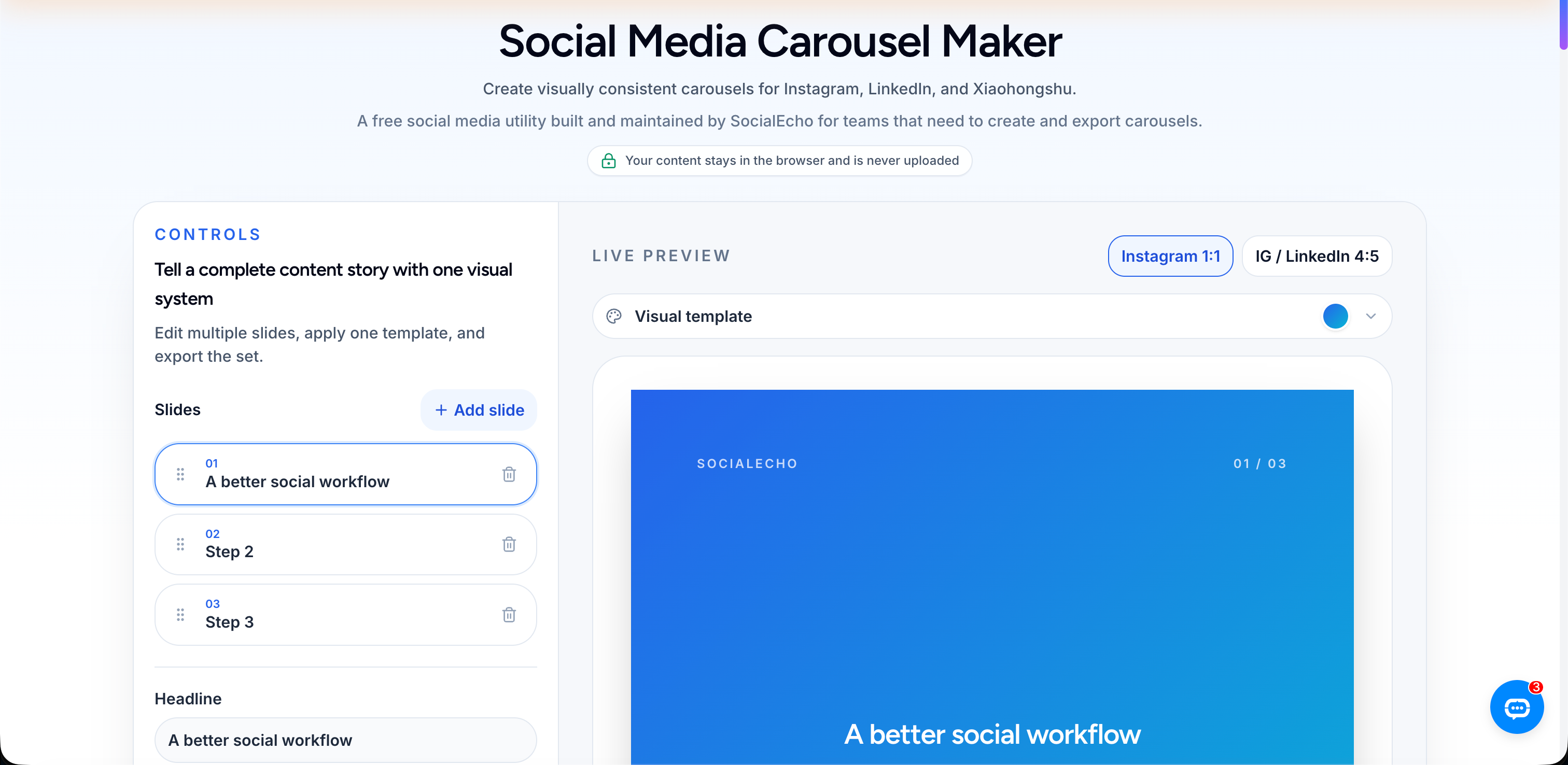
Instagram carousels typically run 4:5 (portrait) or 1:1, LinkedIn's document-style carousels work better a bit wider to suit desktop reading, and Xiaohongshu's photo-text posts also lean toward a portrait ratio close to 3:4. With three different sizing standards, manually re-cropping and relaying out the same set of assets for each platform is one of the steps that most easily bogs down a cluster team — Aya's team once missed resizing for one platform, and the carousel that went out on Facebook had text cropped off on the right edge, prompting someone in the comments to ask "what does the last word say?" That kind of avoidable slip-up is exactly what tooling can prevent — using the Carousel Maker to lay out multiple pages at once against platform-preset sizes, or the Image Resizer to batch-process existing assets, cuts down the time spent manually checking each page one by one.
How Do You Choose a Posting Time?
Carousels depend more than single images on whether users have the patience to swipe slowly in the moment — pick the wrong posting time and completion rate can take a real hit.
Carousels have a particular quirk: completing one requires the user to have the patience to swipe through in that moment, so posting time can affect performance more visibly than it does for single images — post during a window when people are scrolling in quick bursts and swiping away fast, and completion rate takes a hit. Peak activity windows vary by platform and audience — TikTok and Instagram users tend to cluster around commute times, lunch breaks, and before bed, while LinkedIn's professional audience skews toward weekday daytime hours. For a cluster account running several platforms at once, manually logging each platform's historical peak and scheduling around it is an ongoing chore. Some teams use a tool like Best Time Slot Finder as a reference against historical data, then schedule across multiple platform accounts in one place with Publish — cutting down the time spent switching between different backend dashboards.
How Do You Review and Iterate on a Carousel After Publishing?
You can review a carousel down to the page level — which page loses the most viewers, which page draws the most saves or screenshots — and that data is typically more useful than the post's total engagement count.
Aya's team now makes it a habit to go back two or three days after every carousel post and check the completion curve in Analytics, find the page with the sharpest drop-off, and adjust the next similar post accordingly. Where it's practical, a tool like Engagement Rate Calculator can help compare engagement rates across different carousels on the same basis, so raw like counts don't mislead you when follower bases differ. Specific comments are worth watching too — Aya says the comment that stuck with her most was "isn't the price on page 4 a typo?" — it helped her catch a real layout error, more directly than any analytics dashboard could. The point of reviewing isn't to prove which post "went viral" — it's to turn every post into an input for the next one's design, which is also how cluster accounts manage to keep producing content without starting from zero each time.
Carousels Aren't a Magic Formula, But They're Worth Rethinking Seriously
Pulling these pieces together, the core value of a carousel isn't as simple as "just make more images" — it's that the format taps into completion, saves, and dwell time, three signals a single image struggles to trigger together. For cluster creators with limited bandwidth, this is a direction worth investing in — not because it's guaranteed to produce some specific follower-growth number, but because the same raw material, restructured with a different pace, reaches and retains audiences differently.
If an account covers multiple platforms, doing the whole process manually — from planning the page breakdown to exporting multiple sizes to scheduling across accounts — really is tedious. That's why we built the free Carousel Maker tool inside SocialEcho, paired with AI Creation for generating visuals and Engagement for replying to comments across platforms in one place. For teams running several accounts as a cluster, checking out the Matrix Creator Solution may save more time than handling each account by hand.
Frequently Asked Questions
Does a Carousel Post Have to Be Exactly 10 Pages?
No — page count isn't a fixed standard. The number of pages should be dictated by how much information you have, not the other way around, where you stretch content to hit a target page count. The core principle is "one idea per page" — if a topic can be fully covered in 3 pages, forcing it out to 10 just dilutes the information density on each page and raises the odds of users swiping away midway. Aya's example ran 9 pages because the products and criteria she was comparing were genuinely numerous — the page count was a result of the content, not a preset goal.
Does the Carousel Format Work on Xiaohongshu, or Just Instagram and LinkedIn?
Yes — Xiaohongshu's platform format is built around photo-text carousels to begin with. Aspect ratios and audience habits differ across the three platforms: Xiaohongshu leans toward a portrait ratio close to 3:4, and captions there can run a bit longer than on LinkedIn to add detail, while LinkedIn's professional audience responds better to something short and direct. Relaying out content to each platform's preset sizes before posting tends to perform more reliably than reusing the exact same set of assets everywhere.
How Do You Check a Carousel's Completion Rate?
You typically need to look at the page-by-page retention curve in the platform's own analytics dashboard, rather than just the total engagement numbers. Aggregate metrics like likes and comments alone won't show you which page users dropped off on — you need to open the specific post's detail view to see the page-by-page view decay and identify the sharpest drop-off point as the focus for your next iteration.
Carousel vs. Short Video: Which Is Better for a Cluster Account to Test Content Direction?
It depends — the two formats test somewhat different things. A carousel tests whether the information structure and hook hold up; it's relatively cheap to produce and quick to iterate on, which makes it good for quickly validating whether an angle is worth going deeper on. Short video tests narrative pacing and camera language, and it has a higher production bar. For cluster accounts with limited hands on deck, a common sequence is to validate an angle cheaply with a carousel first, then turn the validated angle into a short video — but that's not the only path.
Key Takeaways
- Carousel posts typically outperform single images because they trigger completion, saves, and dwell time all at once — not simply because there are "more images"
- The first-page hook should lead with the conclusion but withhold the details; a clickbait-style empty hook drags down completion rate down the line
- Middle pages should follow three principles — one idea per page, consistent visuals, suspense at the end of each page — with page count set by the amount of content, not a preset target
- The last page should carry a single, specific call to action; that gets followed through on more than asking for several things at once
- Review page-level data for drop-off points and save spikes — it guides the next design better than total engagement numbers alone
One clarification: the completion and save-rate gains a carousel format can bring are the combined result of content quality and an account's existing foundation — actual results vary by account and category, and the figures mentioned in this article come from observing a specific case, not a promise of follower growth or engagement outcomes. Tools and methods can make the process smoother, but the real judgment of whether the content is worth it still comes down to whether users actually want to swipe through to the end.
;}.cls-2{fill:%230868f7;}.cls-3{fill:url(%23未命名的渐变_44);}.cls-4{fill:%23333;}%3c/style%3e%3clinearGradient%20id='未命名的渐变_8'%20x1='33.73'%20y1='100.61'%20x2='-0.03'%20y2='-1.06'%20gradientUnits='userSpaceOnUse'%3e%3cstop%20offset='0'%20stop-color='%237ae9fb'/%3e%3cstop%20offset='0.67'%20stop-color='%232b90f8'/%3e%3cstop%20offset='1'%20stop-color='%230868f7'/%3e%3c/linearGradient%3e%3clinearGradient%20id='未命名的渐变_44'%20x1='27.86'%20y1='18.67'%20x2='68.36'%20y2='22.22'%20gradientUnits='userSpaceOnUse'%3e%3cstop%20offset='0'%20stop-color='%235ac7f2'/%3e%3cstop%20offset='1'%20stop-color='%230868f7'/%3e%3c/linearGradient%3e%3c/defs%3e%3cpath%20class='cls-1'%20d='M29,28.74V81.91l-9.51-3.68v0L8.52,74A7.17,7.17,0,0,1,4,67.32V24.54A3.76,3.76,0,0,1,9.08,21Z'/%3e%3cpath%20class='cls-2'%20d='M68.09,78.07a13.15,13.15,0,0,1-17.9,12.06L29,81.91h0V28.74L50.19,37A13.17,13.17,0,0,0,68.08,25.3h0Z'/%3e%3cpath%20class='cls-3'%20d='M68.08,25.3a13.19,13.19,0,0,1-6.73,10.87A13.09,13.09,0,0,1,50.19,37L29,28.74V6A3.76,3.76,0,0,1,34.1,2.52l25.59,9.91A13.22,13.22,0,0,1,68.08,25.3Z'/%3e%3cpath%20class='cls-4'%20d='M129.06,81.76a4.33,4.33,0,0,1-3.19-1.31,4.4,4.4,0,0,1-1.31-3.24V56.86H97.65V77.21a4.36,4.36,0,0,1-1.35,3.2A4.68,4.68,0,0,1,93,81.76a4.32,4.32,0,0,1-3.19-1.31,4.37,4.37,0,0,1-1.32-3.24V27.27A4.58,4.58,0,0,1,89.83,24a4.59,4.59,0,0,1,7.82,3.27V48.15h26.91V27.27A4.58,4.58,0,0,1,125.91,24a4.59,4.59,0,0,1,7.82,3.27V77.21a4.37,4.37,0,0,1-1.36,3.2A4.65,4.65,0,0,1,129.06,81.76Z'/%3e%3cpath%20class='cls-4'%20d='M163.77,81.66c-6.57,0-11.76-1.92-15.44-5.7s-5.54-9.07-5.54-15.74a26.76,26.76,0,0,1,2.09-10.43,17.72,17.72,0,0,1,6.67-8.06,19.15,19.15,0,0,1,10.68-2.95,19,19,0,0,1,10.46,2.8,18.7,18.7,0,0,1,6.55,7.36,22.53,22.53,0,0,1,2.36,10.28A4.51,4.51,0,0,1,177,63.77H152.23a10.8,10.8,0,0,0,3.49,6.65c2,1.68,4.88,2.52,8.66,2.52a22.25,22.25,0,0,0,7.54-1.21c.74-.3,1.55-.67,2.37-1.07a3.75,3.75,0,0,1,1.84-.4,4.09,4.09,0,0,1,3,1.15,4,4,0,0,1,1.12,3,4.38,4.38,0,0,1-2.58,3.82,32.34,32.34,0,0,1-6.36,2.61A28.67,28.67,0,0,1,163.77,81.66ZM172.4,55.9a9.72,9.72,0,0,0-1.63-4.56A9.9,9.9,0,0,0,167,48a10.38,10.38,0,0,0-4.64-1.14,12,12,0,0,0-4.77,1.06,9.54,9.54,0,0,0-4.89,5.66,11.78,11.78,0,0,0-.51,2.3Z'/%3e%3cpath%20class='cls-4'%20d='M193,81.64a4.49,4.49,0,0,1-4.51-4.55V27.28A4.58,4.58,0,0,1,189.84,24a4.48,4.48,0,0,1,3.28-1.36A4.36,4.36,0,0,1,196.35,24a4.46,4.46,0,0,1,1.31,3.31V77.09a4.34,4.34,0,0,1-1.35,3.2A4.67,4.67,0,0,1,193,81.64Z'/%3e%3cpath%20class='cls-4'%20d='M263.79,81.71a5.7,5.7,0,0,1-4.2-1.74,5.76,5.76,0,0,1-1.73-4.19V27.37a4.58,4.58,0,0,1,1.35-3.27A4.59,4.59,0,0,1,267,27.37V72.53h24a4.58,4.58,0,0,1,3.27,7.82A4.66,4.66,0,0,1,291,81.71Z'/%3e%3cpath%20class='cls-4'%20d='M424.48,81.74a4.71,4.71,0,0,1-2.71-.88,5.43,5.43,0,0,1-1-1l-.07-.09-12.41-17-5.41,5v9.44a4.31,4.31,0,0,1-1.36,3.19,4.66,4.66,0,0,1-3.3,1.36A4.29,4.29,0,0,1,395,80.42a4.36,4.36,0,0,1-1.32-3.23V27.37A4.58,4.58,0,0,1,395,24.1a4.52,4.52,0,0,1,6.58.12,4.54,4.54,0,0,1,1.24,3.15V56.31l17.72-16.38.05,0a4.8,4.8,0,0,1,2.94-1.11,4.4,4.4,0,0,1,3.27,1.2,4.57,4.57,0,0,1,1.2,3.27,4.44,4.44,0,0,1-.77,2.33,7.45,7.45,0,0,1-1.43,1.65l-11,9.64,13.34,17.68a5,5,0,0,1,1,2.71,4.12,4.12,0,0,1-1.36,3.24A4.64,4.64,0,0,1,424.48,81.74Z'/%3e%3cpath%20class='cls-4'%20d='M317.93,81.76a21.5,21.5,0,1,1,21.17-21.5A21.37,21.37,0,0,1,317.93,81.76Zm0-34.1a12.61,12.61,0,1,0,12.42,12.6A12.52,12.52,0,0,0,317.93,47.66Z'/%3e%3cpath%20class='cls-4'%20d='M212.18,101.22a4.12,4.12,0,0,1-3.05-1.26,4.17,4.17,0,0,1-1.26-3.1V43.34a4.37,4.37,0,0,1,1.3-3.14,4.26,4.26,0,0,1,3.13-1.3,4.19,4.19,0,0,1,3.1,1.26,4.32,4.32,0,0,1,1.26,3.16,20.77,20.77,0,0,1,13-4.54,21.51,21.51,0,0,1,0,43,20.51,20.51,0,0,1-13-4.57V96.86a4.15,4.15,0,0,1-1.3,3.06A4.5,4.5,0,0,1,212.18,101.22Zm17.43-53.63c-6.23,0-12.93,4.11-12.93,12.72a12.73,12.73,0,0,0,25.46,0A12.71,12.71,0,0,0,229.61,47.59Z'/%3e%3cpath%20class='cls-4'%20d='M365.76,81.76a21.5,21.5,0,1,1,21.18-21.5A21.37,21.37,0,0,1,365.76,81.76Zm0-34.1a12.61,12.61,0,1,0,12.42,12.6A12.52,12.52,0,0,0,365.76,47.66Z'/%3e%3c/svg%3e)