
How to Turn Customer Reviews Into Social Posts: A 3-Step Guide to Review Graphics
By Liu Yang — covering cross-border e-commerce content
It was two in the morning, and Aya was still going through order notifications. She sells sleep aid diffusers — not a high price point, but repeat purchases have always been solid. Scrolling through the latest reviews, she stopped cold. One customer had written nearly two hundred words: insomnia for the better part of a year, a friend recommended the diffuser, three weeks in and finally sleeping through the night. The review ended with, "Thank you for making this."
She screenshotted the whole thing, captioned it "This made my day," and posted it to the brand's Instagram. She even set it as her phone wallpaper that night, curious to see how people would react the next morning.
She checked the next day: 3 likes, zero comments.
TL;DR: The review itself is genuine and moving, but a raw screenshot rarely gets noticed in a feed — reformatting it into a quote graphic and distributing it across platforms is what actually makes it spread.
- Customer reviews are third-party testimony with relatively strong conversion power, but raw screenshots — small text, cluttered interface — get scrolled past easily in a vertical mobile feed.
- Turning a review from "saved screenshot" into "shareable content" comes down to one concrete step: reformatting it into a quote graphic.
- A quote graphic that works usually has three elements: a bold headline pulled from the review, credibility details, and a small brand mark.
- Once made, a quote graphic can go out across Instagram, Facebook, TikTok Shop, and more all at once — and double as a cover frame for shoppable short-form video.
- Before using a customer review as source material, private details (full names, order numbers) need to be handled carefully, and altering or splicing a customer's actual words risks false-advertising claims.
The review graphics and screenshot cleanup tools mentioned in this piece all come from SocialEcho — an AI-powered social workspace built for e-commerce brands going global, with official direct connections to 11 platforms including TikTok Shop and Instagram. It ties AI content creation, publishing, and engagement management together in one place, which works well for e-commerce teams that need to turn reviews and other raw material into publish-ready content quickly.
Why does nobody engage with customer reviews posted on social?
The reason isn't complicated: when a customer leaves a review on an e-commerce platform or a brand's own site, the font, size, and line spacing are all default system styling. Add in star icons and timestamps, and the whole screenshot ends up looking more like a support ticket than something worth watching twice.
This isn't a one-off problem. What Aya ran into is a wall almost every e-commerce seller running their own social accounts eventually hits — the review itself is genuine and moving, but once it's posted as a screenshot, it just scrolls by. On a vertical mobile screen, people typically decide whether to stop scrolling in under a second, and a screenshot with no visual focal point, with text so small you have to zoom in, rarely gets a second look.
Aya brought this up later in the team chat, wondering if they should redesign it. The closest thing to a designer on the team was an intern who normally touched up product page images. She tried mocking something up in PowerPoint — purple background, yellow text, Impact font — and a coworker quietly joked it "looked like a flyer handed out on the street." After that, Aya didn't touch the idea again. The reviews just kept piling up in the support backend and the order review section, one after another, untouched.
That's exactly where the value gets wasted. A review is third-party testimony — it's naturally more persuasive than copy the brand writes itself, and it tends to convert better. But between "receiving a review" and "turning it into shareable content" sits one specific step: making the graphic. If nobody does that step, the review just stays in its raw form and never becomes anything else.
Aya later talked to someone in a similar spot running a baby products brand, and found they'd hit almost the exact same wall — over two hundred reviews sitting in the backend, most of them customer photos with long written feedback, and the team had never systematically organized any of it. When asked why, the answer was blunt: "Screenshots don't take up space sitting there. Actually turning one into a graphic means picking a layout, choosing fonts, adjusting colors — half an hour per post. Who has time to do that every day?" That comment gets at the real issue — it's not that people don't want to do it, it's that the task defaults to being treated as "design work," requiring specific skills and time, so it naturally sinks to the bottom of the to-do list and stays there indefinitely.
The two ways to present a review — where they actually differ
Breaking this down, raw screenshots and reformatted quote graphics differ noticeably across a few key dimensions:
| Format | Visual polish | Readability | Shareability | Reusability |
|---|---|---|---|---|
| Raw screenshot | Relies on the review page's default styling — star icons, timestamps, and other interface clutter make it look less professional | Small text, tight line spacing; usually needs zooming in to read on mobile | No clear visual focal point, easy to scroll past in a feed | Can only be used as a whole image — no way to pull out individual lines or reformat |
| Quote graphic (reformatted) | Consistent brand visuals — colors and fonts can match brand identity | Large text, short-sentence structure, readable at a glance on mobile | Clear focal point, more likely to get a pause, a screenshot, or a repost | Can be split into multiple quotes, resized for different platforms, and reused as a video cover |
The key point: the same genuine text, presented in a different visual language, communicates at a different rate. That's not luck — that's layout doing its job.
What is SocialEcho?
The product spans content publishing, AI creation (turn a single prompt into an image, video, or caption), engagement management, social listening, analytics, AI automation, and an AI Agent API. Pricing includes a free tier, with Basic and Team plans billed annually; the entry price is relatively friendly for teams managing multiple accounts. This background is useful context for the specific features mentioned later.
What does turning a review into a quote graphic actually get you?
The same review, posted as a raw screenshot versus a reformatted quote graphic, typically produces different engagement — not because the content changed, but because the format shifted into a visual language that fits how people actually read a feed.
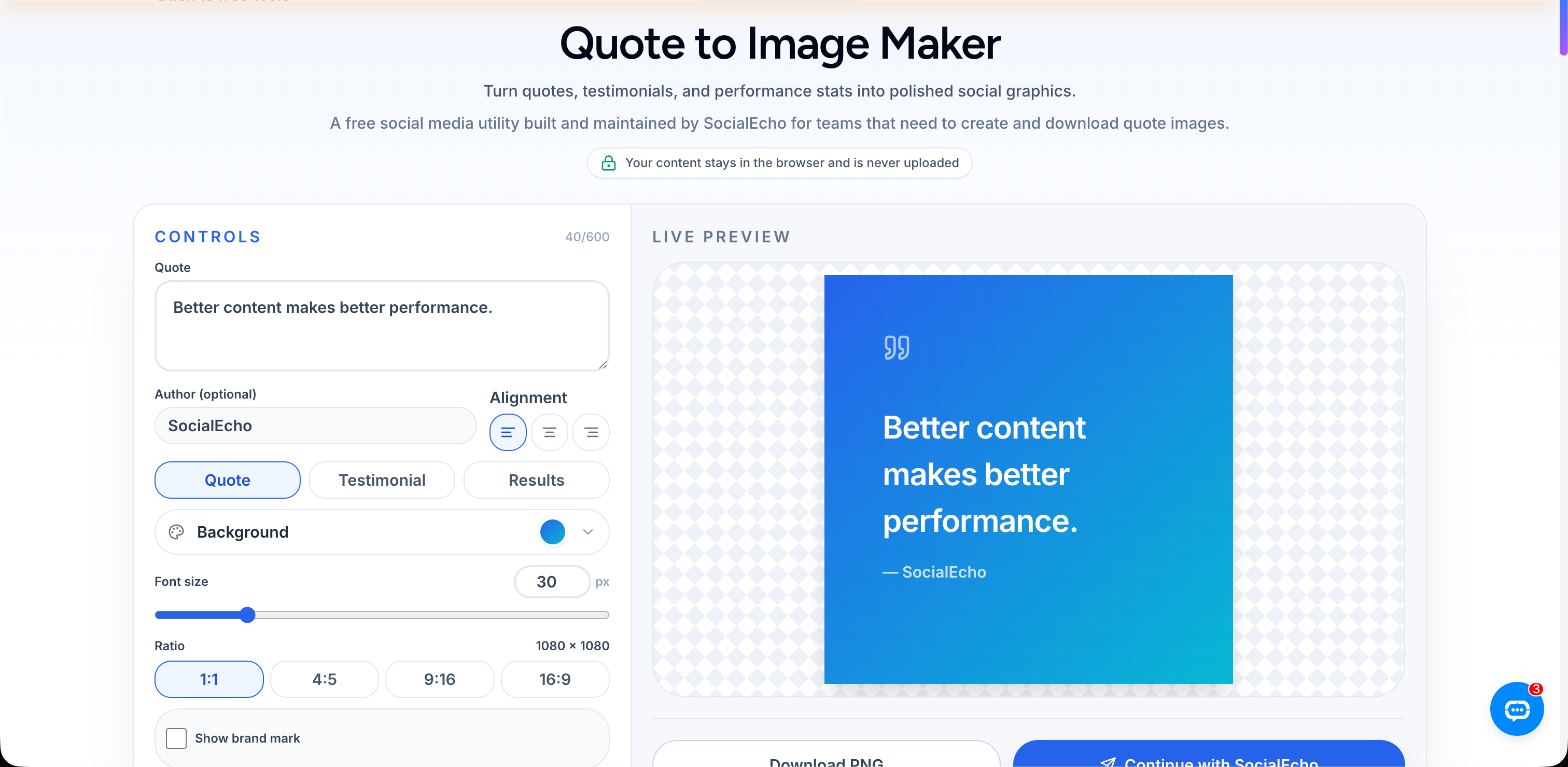
Aya circled back to this a few months later, while looking for a tool to write captions for TikTok Shop videos. She was browsing SocialEcho's hook generator and clicked over to the quote-to-image generator next to it, and on a whim pasted in the text of that five-star review.
A few seconds later, the tool had automatically picked out the most vivid line — "three weeks in, and I'm finally sleeping through the night" — blew it up into a headline, set it against a coral-orange background in bold white text, placed the customer's name and star rating in the bottom right as credibility markers, and tucked a small brand icon in the corner without stealing focus. The whole thing no longer looked like a support log — it looked more like a content card someone would actually save or repost on its own.
She reposted it to Instagram and the TikTok Shop showcase. Compared to the plain screenshot, the difference in engagement that day was obvious.
A review shouldn't sit around as a screenshot in your camera roll — it should be treated as raw material that needs one round of "reprocessing" before it can actually circulate as content.
What really shifted here was how Aya thought about reviews. Most small and mid-sized sellers skip this step — not because they don't value reviews, but because they don't realize there's a specific action missing in between. So rather than treating the quote graphic as a nice-to-have design flourish, it's more accurate to call it the necessary step that turns a review from an archived record into actual content.
What should a review quote graphic actually include?
A quote graphic that works usually comes down to three things: a bold headline, credibility details, and a brand mark — leave any one out, and the result falls short.
Breaking it down further, these three visual elements are:
- Bold headline: Pull the single most vivid, conversational line from the review — not the whole paragraph.
- Credibility details: Note the customer's name, location, or the specific product category they bought. This is more persuasive than just labeling it a "five-star review."
- Brand mark: A small, unobtrusive logo that's still recognizable, so the graphic can be traced back to the brand even after it's been reposted to other accounts.
In practice, making a review quote graphic roughly follows these steps:
- Pull a review from the support backend or the review section that's specific and vivid.
- If the original text came from a screenshot of a DM or chat with a messy background, clean up the extra interface clutter first using a screenshot background cleanup tool.
- Paste the chosen line into a quote graphic tool, adjust the headline size and color scheme to stay consistent with brand visuals.
- Add credibility details (customer name/location/product category) and the brand mark.
- Distribute it across multiple platform accounts at once through a publishing tool, instead of uploading manually one by one.
None of these three steps is hard on its own — the hard part is turning it into an ongoing habit instead of something you do once when you happen to remember. Aya's current approach is to set aside a fixed block of time each week, go through that week's new reviews, pick out the ones with vivid detail, batch them into quote graphics, save them to a dedicated content library, and publish them in stages — instead of waiting for a review that happens to move her personally before doing anything. Once that habit stuck, she noticed her own way of reading reviews changed too — she used to just wait passively for customers to say nice things; now she actively watches for lines worth "pulling out" on their own. Reviews themselves became a content source she could plan around, not just a one-off emotional response.
How do you reuse review content across multiple platforms?
A finished quote graphic doesn't need to be uploaded platform by platform — a publishing tool can distribute it all at once, and the follow-up engagement and analytics can all happen in the same workspace.
Making one quote graphic is just the first step. Aya eventually worked out a process for keeping reviews generating value on an ongoing basis, and the specifics are worth walking through.
Once a quote graphic is laid out, the content publishing module can send it out to an Instagram page, a Facebook page, and a TikTok Shop showcase all at once, without switching between backend accounts.
For sellers running TikTok Shop, review quote graphics have another, more specific use — as the cover image or opening frame for a shoppable video, which tends to hold attention longer than a plain product shot. If there are other unused reviews on hand and it's not obvious which line to pull, SocialEcho's AI creation module can generate a matching short-video script or caption variations based on that customer's original text, cutting down the time spent starting from a blank page.
Once content goes out, the replies need attention too — this kind of repurposed UGC content often draws other customers sharing their own experiences in the comments. Engagement management pulls those comments into one place so nothing gets missed. To check whether this kind of content actually outperforms straight ads, the engagement-rate trends in analytics or Instagram analytics give an answer based on numbers instead of a hunch.
Longer term, if it's worth knowing how brand-related conversation is organically spreading across the web, social listening is worth keeping an eye on too — especially the content customers post and reshare on their own, which tends to be the most genuine source of feedback. This whole approach built around customer reviews is also one of the specific scenarios many e-commerce sellers run into as part of the e-commerce solution.
Frequently Asked Questions
Can I post a review screenshot directly to Instagram?
You can, but results are usually limited. Raw screenshots have small text and cluttered interface elements, making them easy to miss in a feed — Aya's first screenshot post getting just 3 likes is a good example. Reformatting the review text into a bold quote graphic before posting typically gets more pauses and reposts.
What's the difference between a quote graphic and a regular poster design?
A quote graphic focuses narrowly on "one line" — pulling the single most vivid line from a review as the headline, paired with credibility details and a brand mark, in a fairly fixed, simple structure. Regular poster design involves more layout elements and usually needs more design skill and production time.
Do I need design skills to make a quote graphic?
Not necessarily. The version Aya's team first made by hand in PowerPoint got mocked for "looking like a street flyer" because of the lack of design experience. Tools like a quote graphic generator handle headline extraction, color, and layout automatically once you paste in the text — no need to learn layout skills from scratch.
What platforms work well for review quote graphics?
Most social platforms built around images and short video — Instagram feed posts, Facebook pages, TikTok Shop showcase covers — and they also work as opening frames for shoppable videos. Results vary by platform audience and content format, so it's worth checking engagement-rate trends in analytics to judge.
What compliance issues should I watch for when using customer reviews in quote graphics?
If a review contains private details like a full name or order number, redact or anonymize them before publishing. Altering or splicing together a customer's actual words also carries false-advertising risk. It's worth keeping the original authorization record for each review and using it in line with each platform's rules.
Key takeaways
- Customer reviews are third-party testimony with relatively strong conversion power, but raw screenshots — limited by small text, interface clutter, and how people browse a feed — rarely get seen in full.
- Turning a review from "saved screenshot" to "shareable content" comes down to one concrete step: reformatting it into a quote graphic.
- A review quote graphic generally needs three elements working together: a bold headline, credibility details, and a brand mark.
- Once made, a quote graphic can go out across multiple platforms at once, and double as a shoppable-video cover or a starting point for matching captions and scripts.
- Using customer reviews as source material means handling private details responsibly — altering a customer's actual words carries false-advertising risk, so compliant use is a baseline requirement.
Whether a review spreads further depends partly on how genuine the material is, and partly on whether the presentation gives people a reason to stop scrolling. Aya's review about insomnia eventually became a quote graphic she reused across different places — the brand's feed, the TikTok Shop showcase cover, even printed out and taped to the wall of their small warehouse, where the team sees it every time they walk by to pack an order. She says it feels a lot more real than just having it saved as a screenshot on her phone. A quote graphic can amplify how far a genuine review travels, but it can't replace the actual experience of the product itself.
;}.cls-2{fill:%230868f7;}.cls-3{fill:url(%23未命名的渐变_44);}.cls-4{fill:%23333;}%3c/style%3e%3clinearGradient%20id='未命名的渐变_8'%20x1='33.73'%20y1='100.61'%20x2='-0.03'%20y2='-1.06'%20gradientUnits='userSpaceOnUse'%3e%3cstop%20offset='0'%20stop-color='%237ae9fb'/%3e%3cstop%20offset='0.67'%20stop-color='%232b90f8'/%3e%3cstop%20offset='1'%20stop-color='%230868f7'/%3e%3c/linearGradient%3e%3clinearGradient%20id='未命名的渐变_44'%20x1='27.86'%20y1='18.67'%20x2='68.36'%20y2='22.22'%20gradientUnits='userSpaceOnUse'%3e%3cstop%20offset='0'%20stop-color='%235ac7f2'/%3e%3cstop%20offset='1'%20stop-color='%230868f7'/%3e%3c/linearGradient%3e%3c/defs%3e%3cpath%20class='cls-1'%20d='M29,28.74V81.91l-9.51-3.68v0L8.52,74A7.17,7.17,0,0,1,4,67.32V24.54A3.76,3.76,0,0,1,9.08,21Z'/%3e%3cpath%20class='cls-2'%20d='M68.09,78.07a13.15,13.15,0,0,1-17.9,12.06L29,81.91h0V28.74L50.19,37A13.17,13.17,0,0,0,68.08,25.3h0Z'/%3e%3cpath%20class='cls-3'%20d='M68.08,25.3a13.19,13.19,0,0,1-6.73,10.87A13.09,13.09,0,0,1,50.19,37L29,28.74V6A3.76,3.76,0,0,1,34.1,2.52l25.59,9.91A13.22,13.22,0,0,1,68.08,25.3Z'/%3e%3cpath%20class='cls-4'%20d='M129.06,81.76a4.33,4.33,0,0,1-3.19-1.31,4.4,4.4,0,0,1-1.31-3.24V56.86H97.65V77.21a4.36,4.36,0,0,1-1.35,3.2A4.68,4.68,0,0,1,93,81.76a4.32,4.32,0,0,1-3.19-1.31,4.37,4.37,0,0,1-1.32-3.24V27.27A4.58,4.58,0,0,1,89.83,24a4.59,4.59,0,0,1,7.82,3.27V48.15h26.91V27.27A4.58,4.58,0,0,1,125.91,24a4.59,4.59,0,0,1,7.82,3.27V77.21a4.37,4.37,0,0,1-1.36,3.2A4.65,4.65,0,0,1,129.06,81.76Z'/%3e%3cpath%20class='cls-4'%20d='M163.77,81.66c-6.57,0-11.76-1.92-15.44-5.7s-5.54-9.07-5.54-15.74a26.76,26.76,0,0,1,2.09-10.43,17.72,17.72,0,0,1,6.67-8.06,19.15,19.15,0,0,1,10.68-2.95,19,19,0,0,1,10.46,2.8,18.7,18.7,0,0,1,6.55,7.36,22.53,22.53,0,0,1,2.36,10.28A4.51,4.51,0,0,1,177,63.77H152.23a10.8,10.8,0,0,0,3.49,6.65c2,1.68,4.88,2.52,8.66,2.52a22.25,22.25,0,0,0,7.54-1.21c.74-.3,1.55-.67,2.37-1.07a3.75,3.75,0,0,1,1.84-.4,4.09,4.09,0,0,1,3,1.15,4,4,0,0,1,1.12,3,4.38,4.38,0,0,1-2.58,3.82,32.34,32.34,0,0,1-6.36,2.61A28.67,28.67,0,0,1,163.77,81.66ZM172.4,55.9a9.72,9.72,0,0,0-1.63-4.56A9.9,9.9,0,0,0,167,48a10.38,10.38,0,0,0-4.64-1.14,12,12,0,0,0-4.77,1.06,9.54,9.54,0,0,0-4.89,5.66,11.78,11.78,0,0,0-.51,2.3Z'/%3e%3cpath%20class='cls-4'%20d='M193,81.64a4.49,4.49,0,0,1-4.51-4.55V27.28A4.58,4.58,0,0,1,189.84,24a4.48,4.48,0,0,1,3.28-1.36A4.36,4.36,0,0,1,196.35,24a4.46,4.46,0,0,1,1.31,3.31V77.09a4.34,4.34,0,0,1-1.35,3.2A4.67,4.67,0,0,1,193,81.64Z'/%3e%3cpath%20class='cls-4'%20d='M263.79,81.71a5.7,5.7,0,0,1-4.2-1.74,5.76,5.76,0,0,1-1.73-4.19V27.37a4.58,4.58,0,0,1,1.35-3.27A4.59,4.59,0,0,1,267,27.37V72.53h24a4.58,4.58,0,0,1,3.27,7.82A4.66,4.66,0,0,1,291,81.71Z'/%3e%3cpath%20class='cls-4'%20d='M424.48,81.74a4.71,4.71,0,0,1-2.71-.88,5.43,5.43,0,0,1-1-1l-.07-.09-12.41-17-5.41,5v9.44a4.31,4.31,0,0,1-1.36,3.19,4.66,4.66,0,0,1-3.3,1.36A4.29,4.29,0,0,1,395,80.42a4.36,4.36,0,0,1-1.32-3.23V27.37A4.58,4.58,0,0,1,395,24.1a4.52,4.52,0,0,1,6.58.12,4.54,4.54,0,0,1,1.24,3.15V56.31l17.72-16.38.05,0a4.8,4.8,0,0,1,2.94-1.11,4.4,4.4,0,0,1,3.27,1.2,4.57,4.57,0,0,1,1.2,3.27,4.44,4.44,0,0,1-.77,2.33,7.45,7.45,0,0,1-1.43,1.65l-11,9.64,13.34,17.68a5,5,0,0,1,1,2.71,4.12,4.12,0,0,1-1.36,3.24A4.64,4.64,0,0,1,424.48,81.74Z'/%3e%3cpath%20class='cls-4'%20d='M317.93,81.76a21.5,21.5,0,1,1,21.17-21.5A21.37,21.37,0,0,1,317.93,81.76Zm0-34.1a12.61,12.61,0,1,0,12.42,12.6A12.52,12.52,0,0,0,317.93,47.66Z'/%3e%3cpath%20class='cls-4'%20d='M212.18,101.22a4.12,4.12,0,0,1-3.05-1.26,4.17,4.17,0,0,1-1.26-3.1V43.34a4.37,4.37,0,0,1,1.3-3.14,4.26,4.26,0,0,1,3.13-1.3,4.19,4.19,0,0,1,3.1,1.26,4.32,4.32,0,0,1,1.26,3.16,20.77,20.77,0,0,1,13-4.54,21.51,21.51,0,0,1,0,43,20.51,20.51,0,0,1-13-4.57V96.86a4.15,4.15,0,0,1-1.3,3.06A4.5,4.5,0,0,1,212.18,101.22Zm17.43-53.63c-6.23,0-12.93,4.11-12.93,12.72a12.73,12.73,0,0,0,25.46,0A12.71,12.71,0,0,0,229.61,47.59Z'/%3e%3cpath%20class='cls-4'%20d='M365.76,81.76a21.5,21.5,0,1,1,21.18-21.5A21.37,21.37,0,0,1,365.76,81.76Zm0-34.1a12.61,12.61,0,1,0,12.42,12.6A12.52,12.52,0,0,0,365.76,47.66Z'/%3e%3c/svg%3e)